

Tea Xotic Envisioned
A conceptual re-envision of the ecommerce website.
This project was a solo effort in which the ecommerce website was evaluated and tested to improve the functionality for the users and the business needs.
Overview
Background
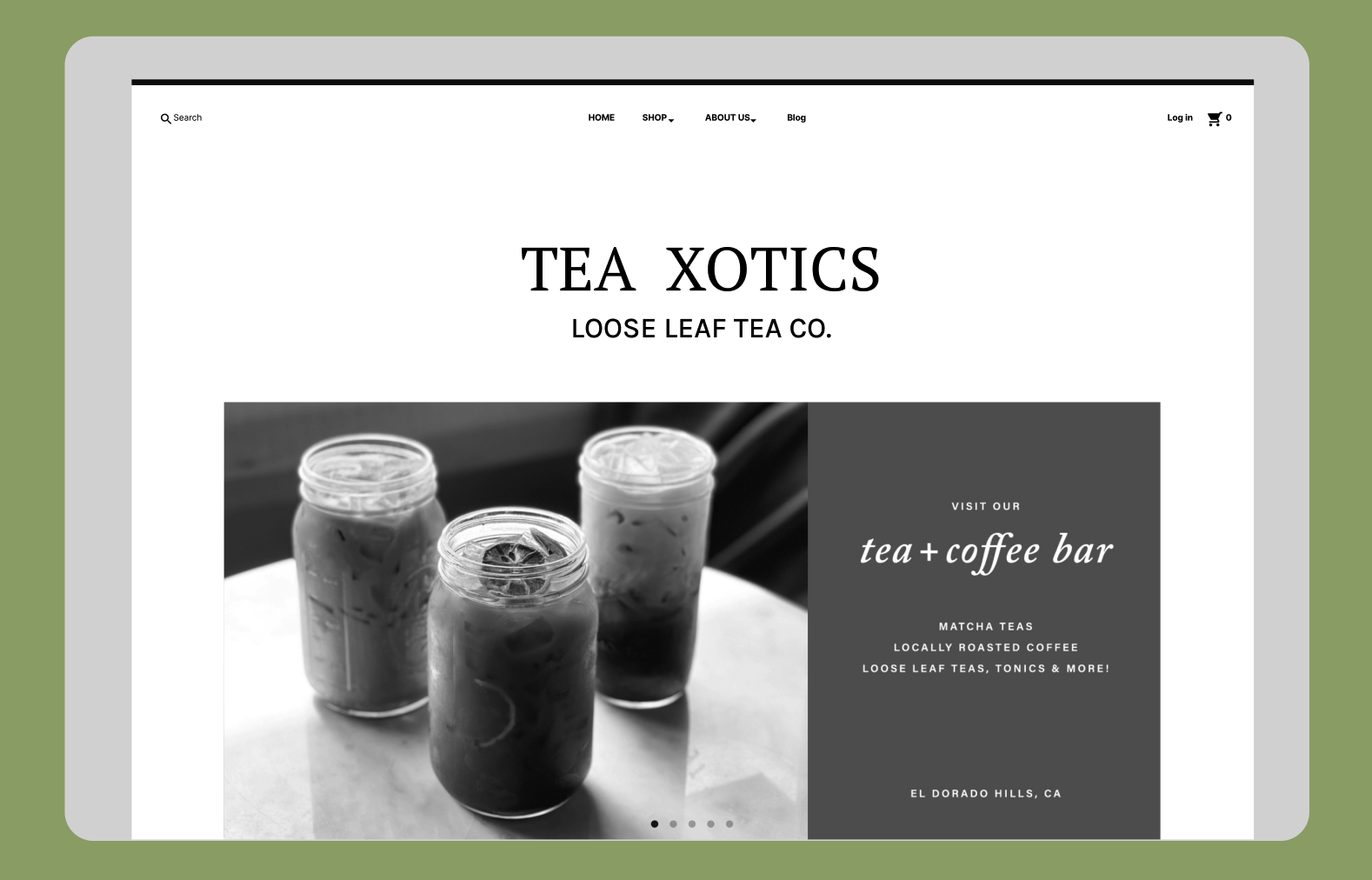
A family business established in 2018 on the outskirts of Sacramento, California. Tea Xotics is a cafe boutique known for their large selections of tea and scented products.
“Us at Tea Xotics we put an emphasis on community through our family friendly experience”
Role
Solo UX Designer
Timeline
2 week design sprint
Layout
Desktop Website
Tools
Figma, Figjam, Canva, Optimal Workshop, Google Suites
The Process
Using the Double Diamond thinking methodology, I was able to create this project.
Select the Circle Below to jump to specified selection.
Discover
Heuristic Evaluation
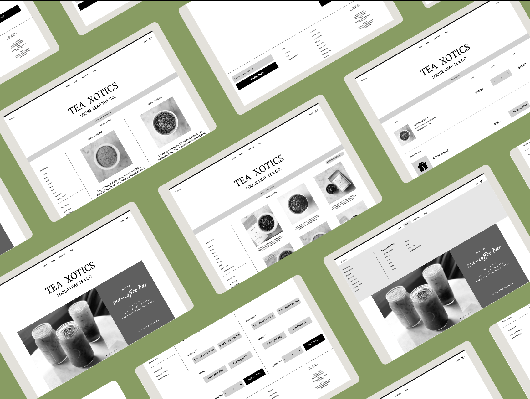
The first step I took was to use Jakob Nielsen’s 10 general principles of design. I applied these rules and applied them to the website in order to analyze the elements of the Tea Xotics website. To view the report click here .

Assessing the current state of the website
The next step taken in the assessment of the website was to analyze these problems. Consistency was a very important factor and through some contextual inquiries I was able to affirm the violations I had gathered.
The Tea Xotics website had proven to be a sound model following most proper principles of design but these contextual interviews would be the data I needed to collect.
3 Key Take Aways

-
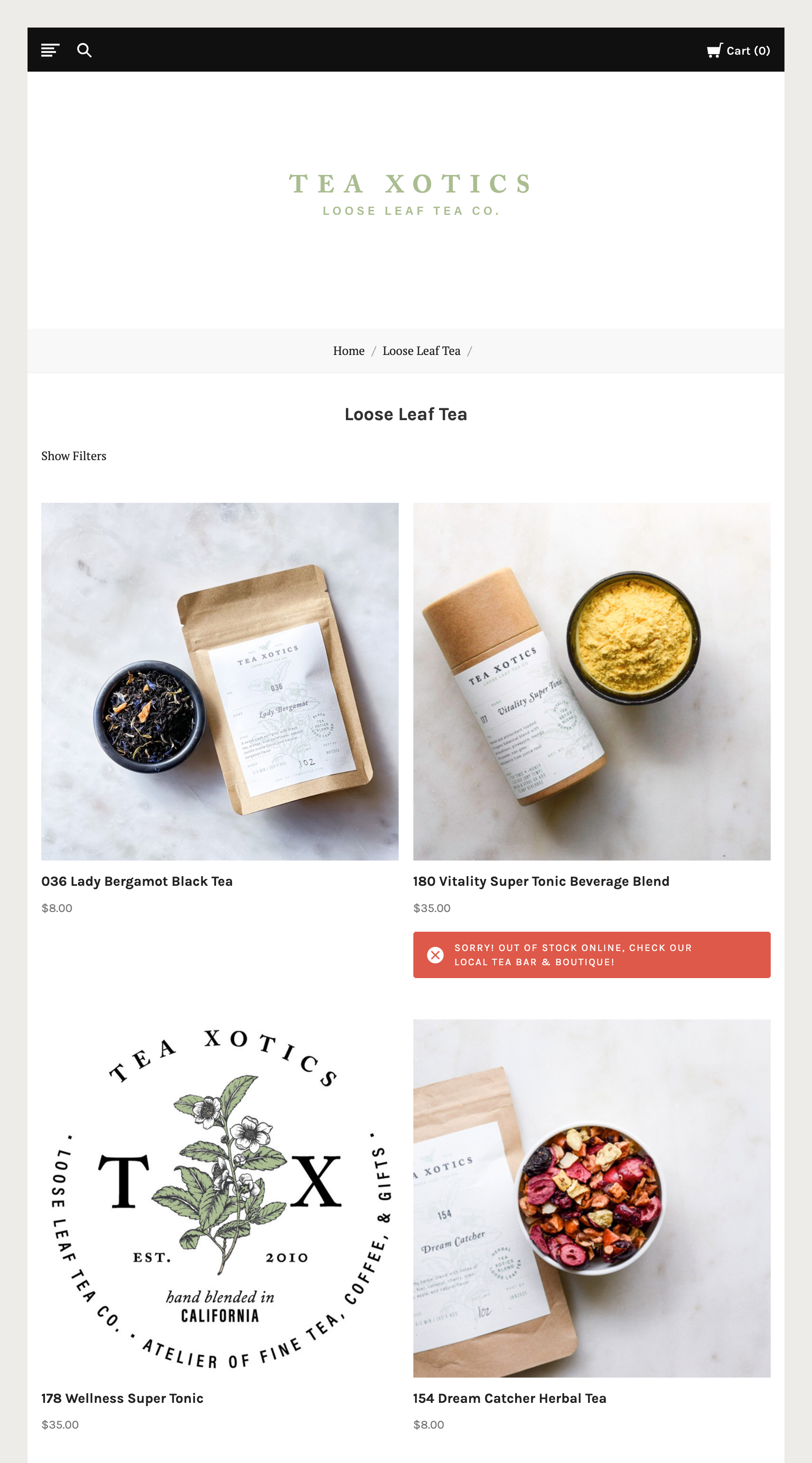
When exploring the website 4/5 users found it difficult to find the gift wrapping selection without a hint. The visibility was difficult to find and was not up to WCAG standards.
-
Information was poorly displayed. When the user would go about searching up the stores location and hours 3/5 users could not properly find this information.
-
5/5 users could not successfully find and (or) use the comparison feature on the website. This would prove to be an important feature that users would like to use on each of their visits to the website.
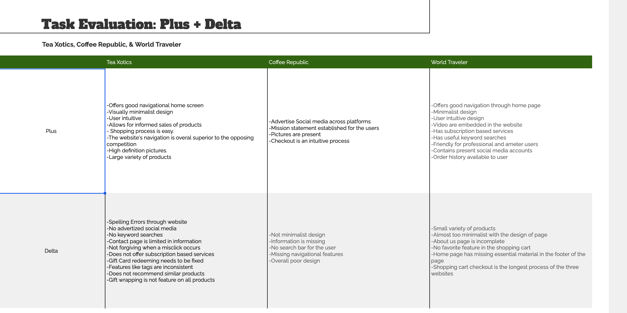
Competitive Analysis
-
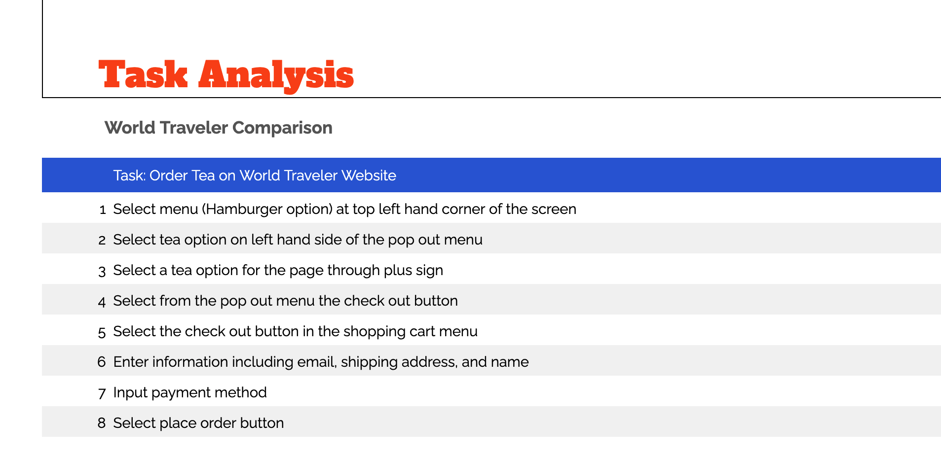
![]()
The main competitor, World Traveler, averaged 8 clicks to checkout when the task analysis was conducted.
-
![]()
In the Feature Analysis the main missing features were the Social Media, Subscription based services, & Keyword Searches.
-
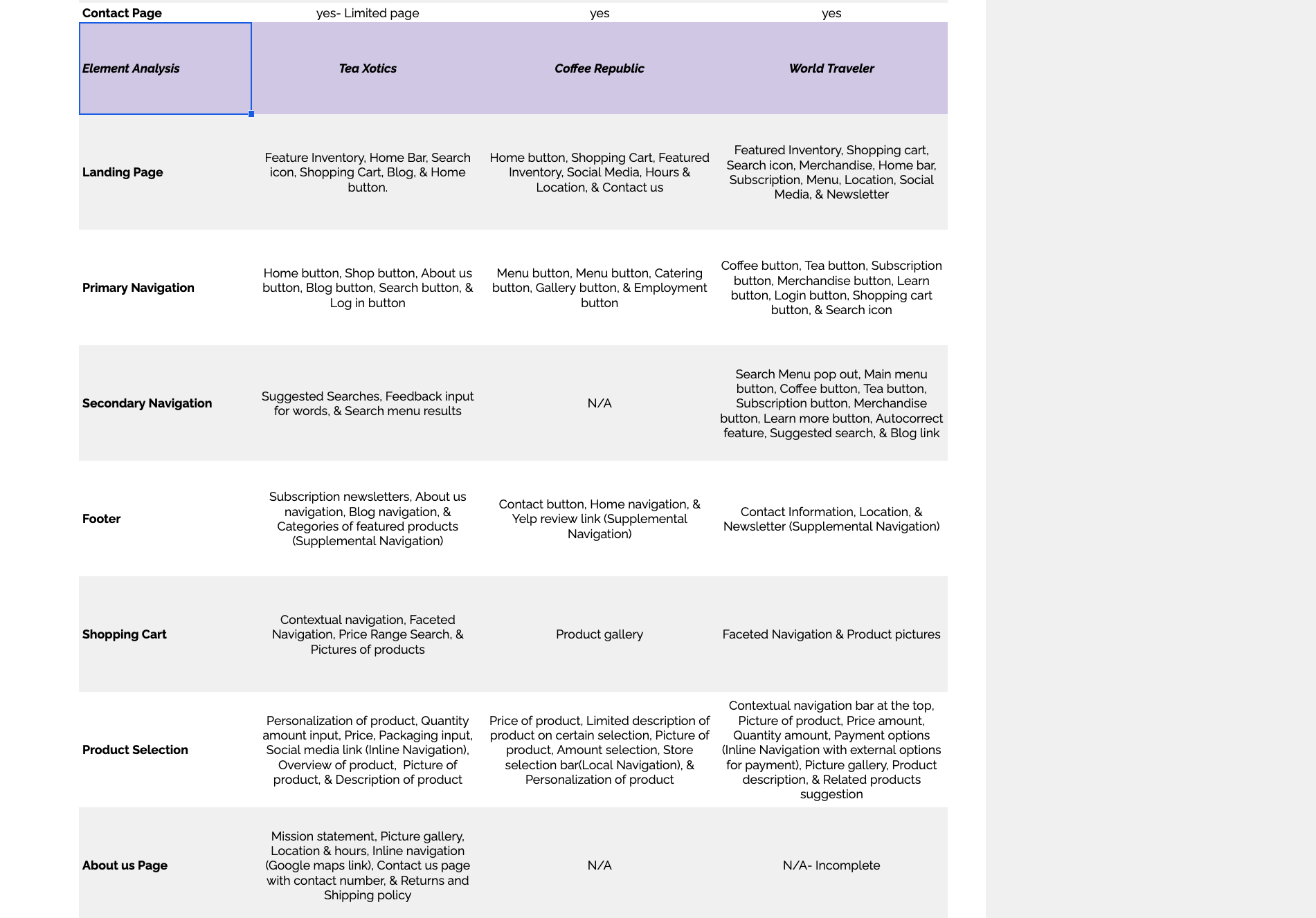
![]()
In the Element Analysis the main missing elements occured in the Footer.
-
![]()
The main takeaway from the Plus + Delta was that Tea Xotics was missig some of the graphic elements that Coffee Republic and World Traveler had.


PERSONA
After the users needs had been analyzed and the website evaluated was I am to understand the users perspective. This persona was created in order for me to empathize with the average person who comes to Tea Xotics. From there I was able to bring my How Might We’s & Problem Statement together into a fully fleshed out main points.
DEFINE
How Might We
How might we make it easier to find gift through the website?
How might we fill the criteria for the gift?
How might we help the user find gifts last minute?
PROBLEM STATEMENT
Sandy needs to be able to send last minute presents to their friends. Being accurate and efficient is of the upmost importance.
How might we help them make the right decisions?
How might we provide similar products to the ones purchased previously?
How might we incorporate a search feature for their budget?
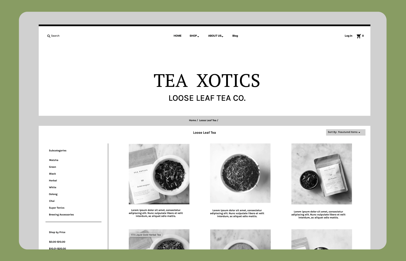
SiteMap
I used information architecture best practices and data from the competitive analyses to include the new mapping sites I would add to the website. In order to ensure that it would provide a user-friendly navigation through the app.
User Flows
The Sitemap helped me envision which user flows I needed to focus my direction of work upon. The two user flows are the fitting task my user would need.
Design
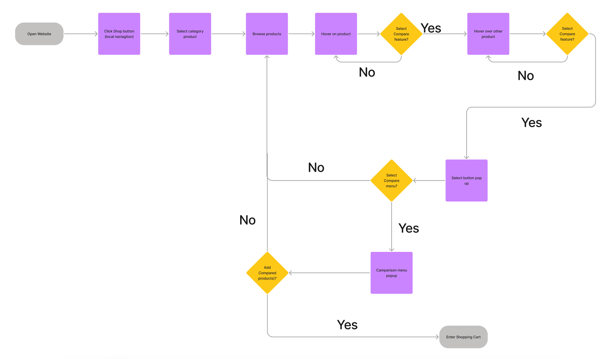
User Flow #1- Find and compare two products in the shop menu

User Flow #2- Add gift wrapping to a selected product
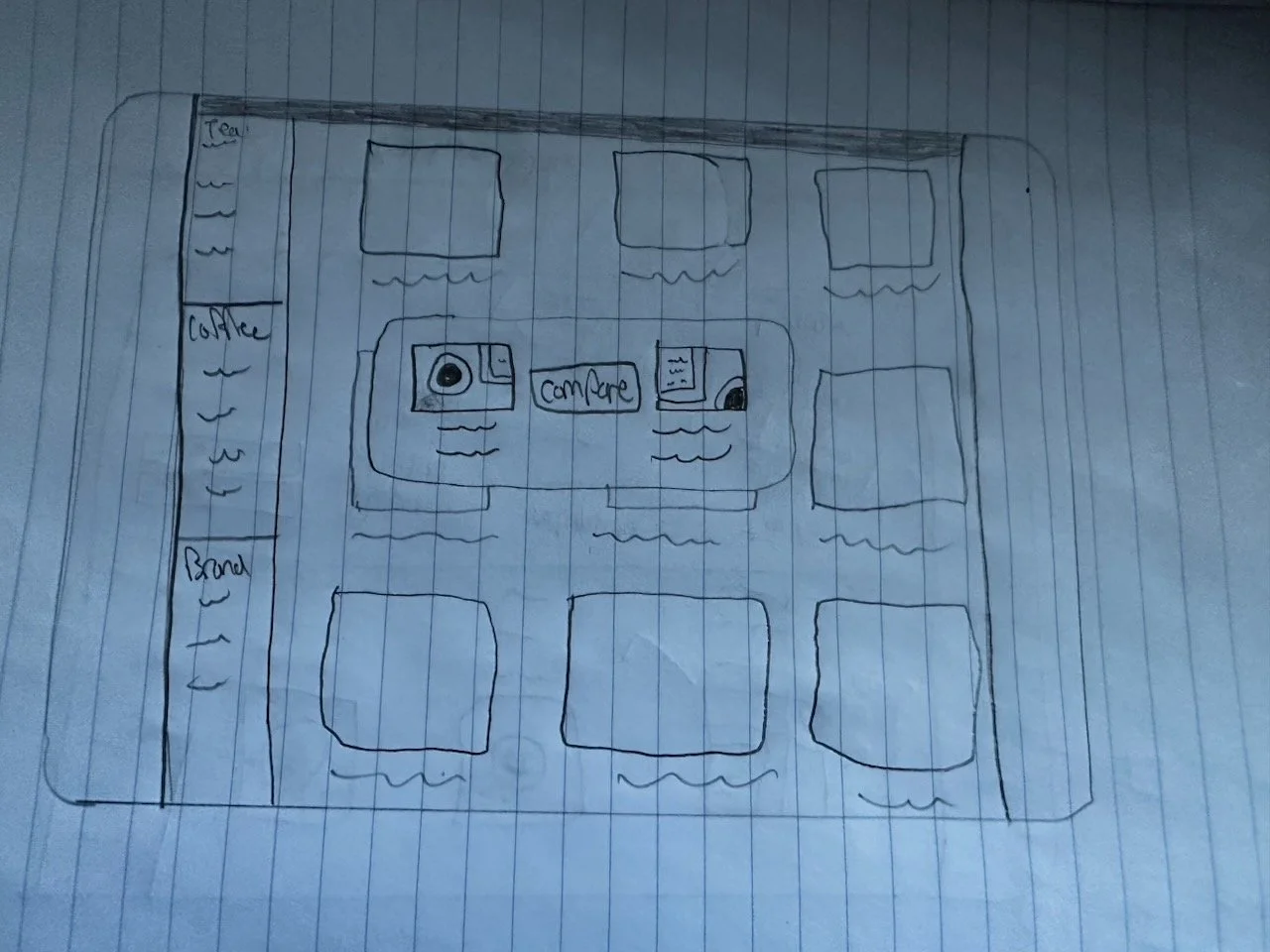
Sketches
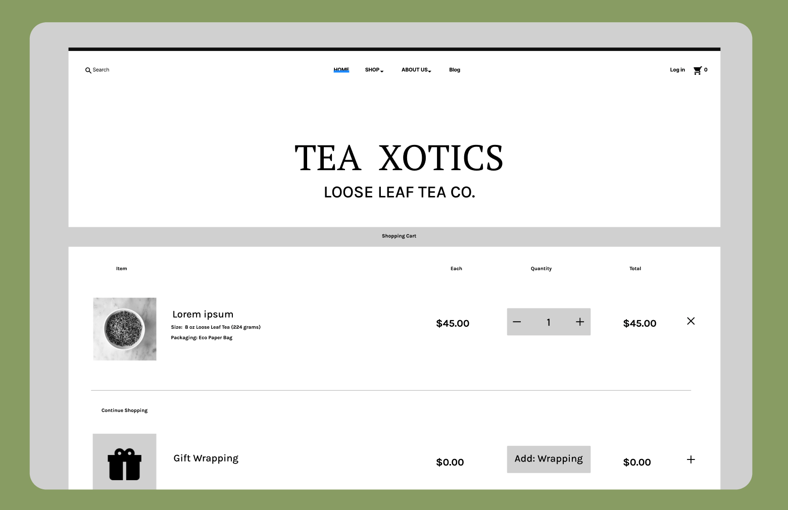
At this point in the process I was jumping at the ideas in which I could implement my interface designs to the current layout. I started with some of the key screen I would be creating. A new revised bottom navigation, a revised comparison feature, and a variable gift wrapping feature for the gifts purchased.


This visualizes the shopping cart window that allows for gift wrapping to be added at checkout.
The comparison button will now be displayed front and centered in the page when clicked.
The users will finally find the location of the store in person when looking at the bottom footer on the page.
Wireframes
-
![]()
Comparison screen between two products
-
![]()
The gift wrap selection at check out
-
![]()
Product selection menu
-
![]()
Home menu


Prototyping
From the wireframes I to connected the frames into my first mid-fidelity prototype
Deliver
After designing for the needs of the business and user I had to test its functionality. I conducted Usability Tests to find pain points and areas of improvement.
Iteration from Usability Testing

-
When the user is faced with selecting another product when, using the comparison feature, I initially created it so that you would have to select the button labeled “Find other product”. 5/5 users would instead select the check mark on another product.
-
There were buttons scattered throughout the comparison screen that needed to be selected in order to continue. 3/5 users needed help in order to continue.
-
A menu pop up would hinder the view of the user when selecting a product.
-
When the user goes to enter the shopping cart a button appears on screen. 2/5 users found the design of the button to be visually off putting.
Solution
After applying the feedback from the usability testing the mid-fidelity was ready. Click here to view the design.
Conclusion
Impact
This redesign was noted as being a hard assignment by my colleagues and my teachers. Being that this was my first attempt in creating a mid fidelity design I consider this a rather successful journey. I learned more about the discovery process than ever before. This notional redesign serves the business and the user better than ever before. Even in the simplistic aspects in which I made the design better.
Next Steps
The first step in making this better would be bringing this website into a high fidelity design.
Users also noted to me that some of my designs could use better shading to make more accessible to those with visual difficulties.
Having another round of usability testing would prove to be useful as there was not as much input as I had hoped.