

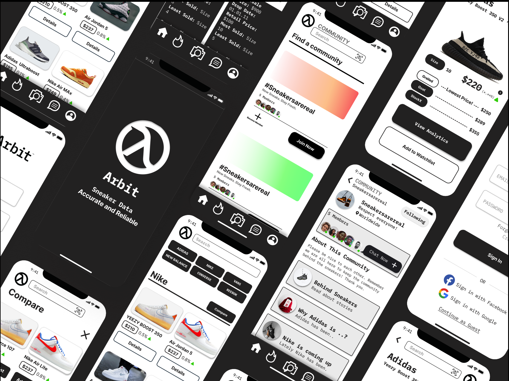
Arbit Analytics App
The design and research for a responsive application to hit the iOS marketplace.
In this project a team of five UX designers worked together to design the vision of the client while building the groundwork for the users experience.
Background
Arbit is a application centered around the transformation of the secondary retail market, bringing together community and transparency in pricing.
“Arbit is here to brings transparency to pricing and helps people understand pricing, educate people, and bring together a community. “
Overview
Role
Project Manager
Timeline
2 week design sprint
Layout
iOS Application
Tools
Figma, Miro, Optimal Sort, Asana, Google Suites
The Process
Using the Double Diamond thinking methodology, I was able to collaborate with my team on this project.
Select the Circle Below to jump to specified selection.
Discover
The Problem
The client assigned to us these existing problems:
Finding prices of sneakers across various platforms is time-consuming
Users want one platform to verify prices, connect to others and organize their collections.
The community aspect of sneaker culture is very important to users that sometimes gets lost
User Survey
The first step in discover was to gather general knowledge about the secondary selling market. In order to empathize with this community we had to get some questions answered. To view the survey click here. After receiving 80+ responses we followed up interviewing those individuals.
User Interviews
There were 14 interviews that took place. We organized the data into an affinity map in order for us to analyze the ideas. These were the takeaways that we concluded.

-
71% said that they want to compare more data than just that of the current market price of the sneaker. They feel limited and look at buying and selling sneakers to more of buying and selling a stock. They would like to know factors such as units bought and sold recently, the hype surrounding a shoe, the year the shoe came out, and many more factors.
-
64% said that when it comes to buying and selling sneakers usually it is difficult to compare pricing on multiple different applications at once.
-
50% would like that information at the touch of their fingertips. It was stated that users will often research the shoe after already arriving at the sellers location. This would mean that there is an urgency when it comes to buying the shoe.
-
57% noted that being a part of the community is extremely important to them. 3/14 users also stated that it is the only element keeping them a part of the sneaker community still.
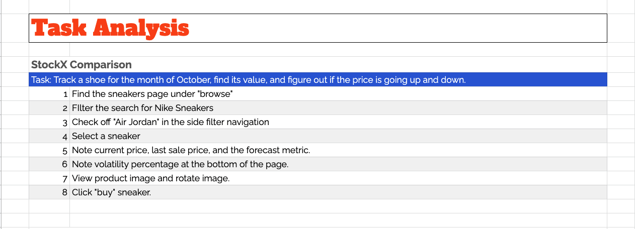
Task Analysis

Feature Analysis

Plus + Delta
-
To view this report click here.
Competitive Analysis
To expand our research we looked at some potential competitors. The corporations we believed to be competitors consisted of were Sole Collectors and Stock X.
AirDNA, Moody’s, & Auto Trader were analyzed in order to aide in the upcoming design process. These were similar in design in what the client imagined for the application.
-
To view this report click here.
-
To view this report click here.
3 Key Takeaways
The takeaways we concluded from this study was as follows:
Most of these competitors are selective in the amount of data they display to users, which can lead to frustrations.
User account, a search bar, and a primary navigation that allows users to quickly find products were positive features
Some platforms use filters to let users control the amount of data/information they want to see
Define
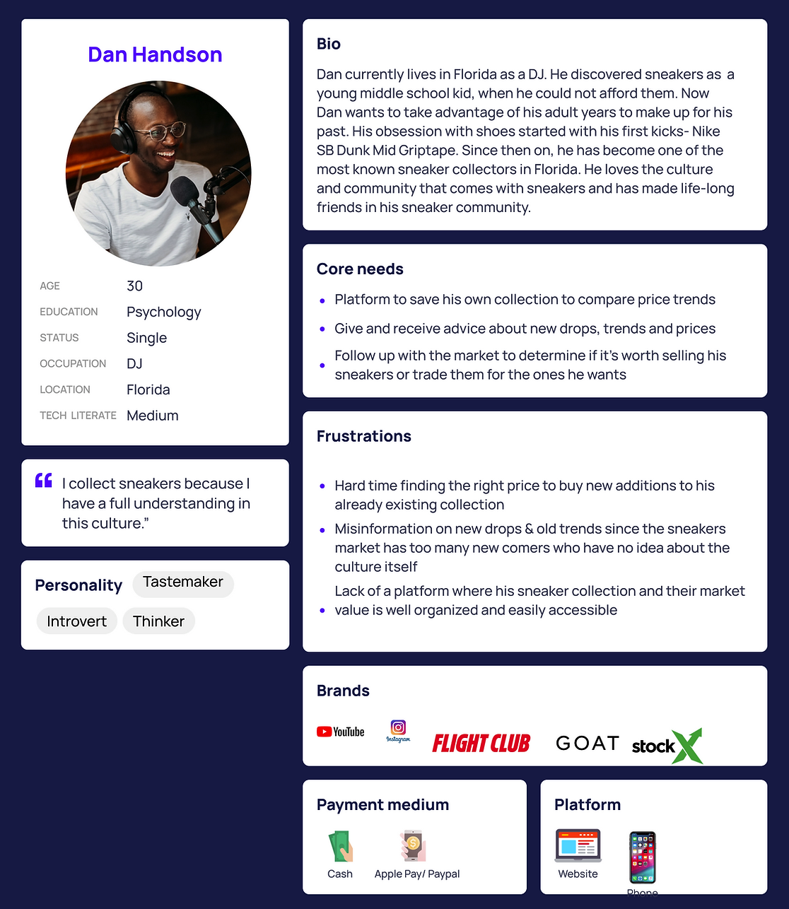
Personas
After discovering the pain points and goals for the audience, we were able to create 2 persona to keep in mind while we designed the application to represent our target users: sneakerhead seller/buyer and the collector.
Together as a team, we also refined the problem statements, focusing on what Arbit needs, and the needs of both target users.

-
1. Alex is a sneaker enthusiast who needs a platform he can trust to track the pricing of sneakers easily because he wants to determine their projected long-term and short value.
2. Dan is a sneaker collector who needs an app that provides him easy access to his collections and the data analytics of each item, because he wants to better manage his collection and investment.
-
How might allow users to track the pricing history of a product?
How might we display data analytics in an easy to read way?
How might we allow users to search for item easily?
How might we create a list of user likes/favorites that they can track later?
How might we give information to users about price projections and potential value growth?
How might we suggest related items to users when they are tracking a product?
How might we manage the communication between sellers/buyers on different platforms more efficiently and easily?
How might we provide all the necessary information regarding timing and quantity of sales?

Card Sorting
In order to determine the global navigations in the app, we turned to card sorting to help empathize with the users preference for global navigation. We received input from 14 participants and the results were. To view the report click here.
-
Profile
Notifications
Search
Data Analytics
Chat/Community option
Design
User Flows
In order for my team to continue we would have to focus on specific tasks essential to the data received by our users. We realized that in order to succeed we wouuld need three key tasks. To view the user flows click here.
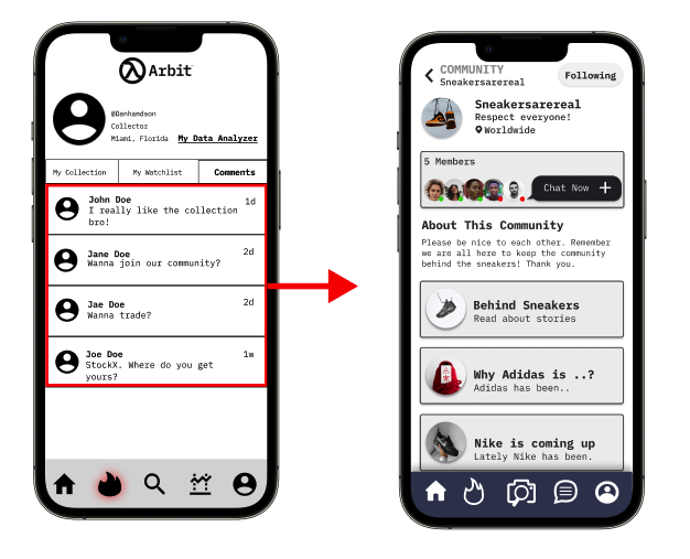
Flow #1- Alex tracks the price of a sneaker he just scanned and adds it to watchlist for future tracking.
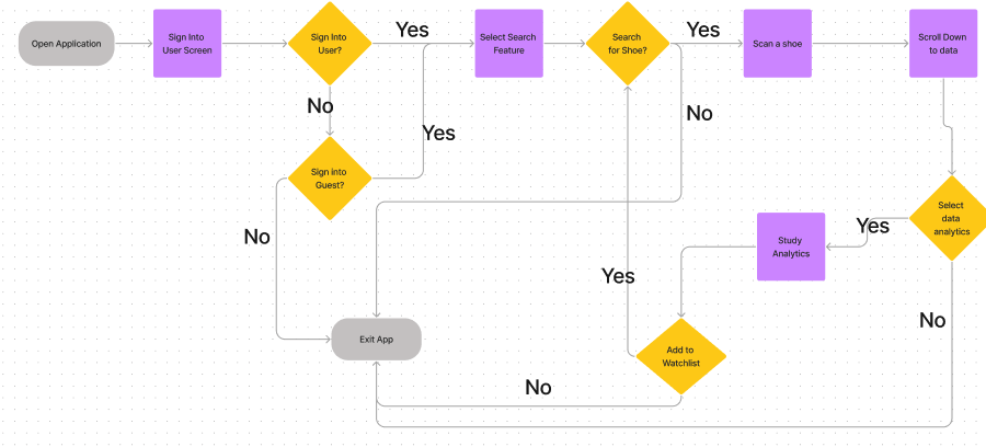
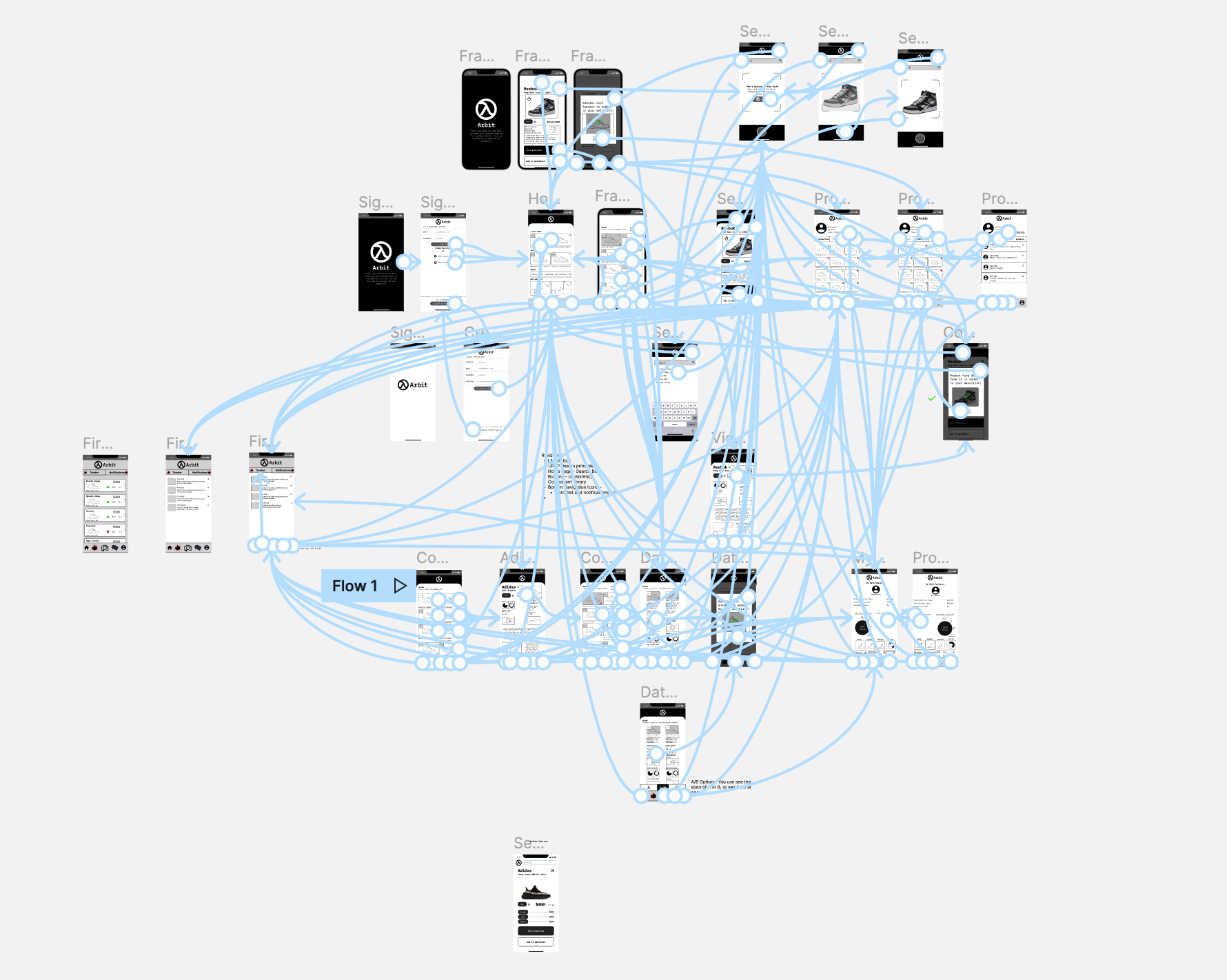
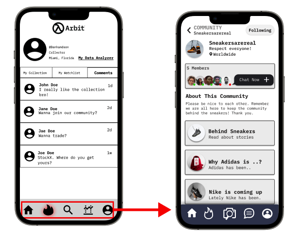
Flow #2- Dan joins the community called Sneakersarereal, and follows to participate in a conversation between other users about a new drop.
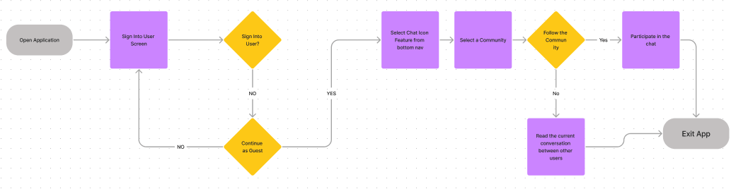
Flow #3- Dan finds this latest Nike drop and compares it to other sneakers of its kind to verify its value.

Blueprint
These designs for the application were the first steps for the Arbit application. Knowing that this information would be handed off to software engineers I believed it necessary to supply a blueprint of the anticipated systems and how they would work with each other. To view the report click here.

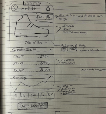
Sketches
Sketches helped us visualize the app and ideate our different ideas. To view the sketches click here.


Sitemap
Using the data from the card sorting method, architecture best practices and data from the competitive analyses the team created a new site map for the app. We ensured that it would provide a user-friendly navigation through the app.
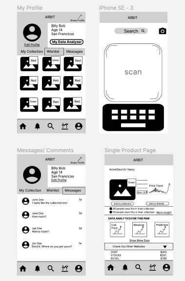
Wireframes
The team all decided to work on wireframes separately in two sessions. This helped us visualize our design ideas especially since there was no previous work provided to us by the client. if you would like to view more click here.


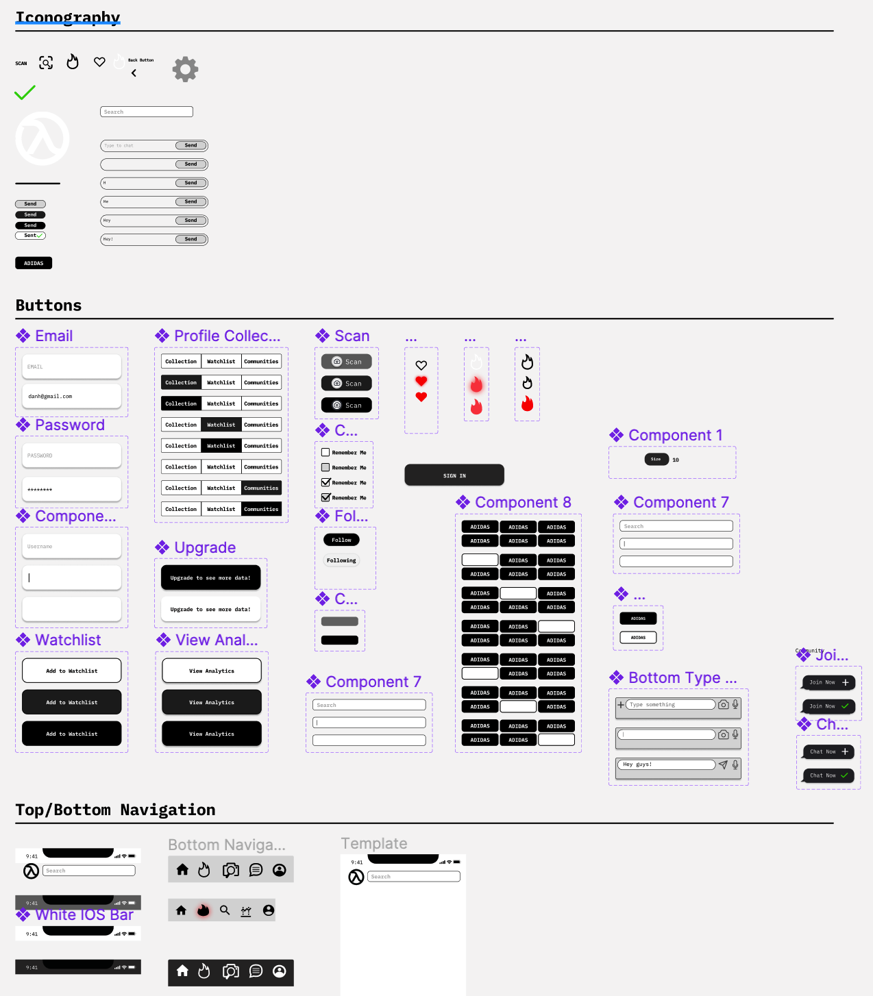
Style Guide
One of my group and I worked diligently to design the style guides, components, and even custom graphics for this application. We also included custom fonts, buttons, navigation, and color palette exclusive to Arbit’s image. To view the Style Guide page click here.
Prototyping
After the wireframes were decided upon and then turned into low-fidelity we began prototyping. This would lead into the first round of usability testing and reiteration.
Deliver
After meeting with the client and getting feedback to fill their business needs we decided to spend some time and get input from our anticipated users. We conducted two rounds of usability tests (14 participants) in order to ensure a pleasant user experience.
Key Insights from 1st Usability Tests
13 / 14 users were able to complete their tasks.
14 / 14 users were able to compare the data on the shoes presented.
13 / 14 users could add shoes to their watch list.
10 / 14 users were confused with the correlation of certain graphic icons (ex. fire icon, search icon, & comment icon).
13 / 14 users found it difficult to scan a shoe.
13 / 14 users noted that they would enjoy the community aspect.
Iteration from Usability Test #1
-
71% of users noted that the graphic icons were confusing in design. They weren’t sure what to correlate the designs with when clicking them.
-
93% of users noted that they loved the idea of having a community tab. They noted that it would keep them coming back to the app in keeping involved in the community.
-
One of the user flows was to scan a shoe and add it to their watch list. 93% of users noted that it was difficult for them to find that feature without a verbal hint.
Key Insights from 2nd Usability Tests
In the second round of usability testing we made sure to fix the pain points and frustrations and also update the cosmetics. We followed up with another round of usability testing (15 participants) and this is what we concluded.
13/15 users easily completed their tasks.
15/15 users were able to add a new pair of sneakers to their watchlist.
12/15 users thought the app was easy to navigate through.
3/15 users wished that the bottom navigation icons were labeled while hovering.
Solution
After implementing much of the feedback we received from both rounds of usability testing it was now time to present to the client. Click here to view the document.
Conclusion
Impact
Starting with only an idea my team and I did an amazing job of building this idea for an app. Our client was very interested in the discovery aspect of the process and seemed as if we served the purpose of reinforcing their doubt in this app. My team worked to serve the client and the users who will eventually use this app. The software engineers even noted that we helped save them lots of time with the programming of the application and the graphic designs that we made custom for this app were a lovely touch. Overall this would allow for an easier transition for the business.
Next Steps
11/15 users were still confused by the new fire icon, I would like to work in labeling and testing out some of the icons that still caused a bit of confusion.
4/15 users took longer to compare two sneakers, I want to work on some more user testing. My team ran out of time when working on this project trying to put together a deliver that would satisfy the client. The scop was too large for only a two week time period and some areas had to be pushed off.
The community aspect was something noted as being a significant find for the sneaker community as they don’t have an outlet that is notable. I love to apply the double diamond method once more and focus some more energy into discovery for this aspect of the app.